Editor UI work
Hello!
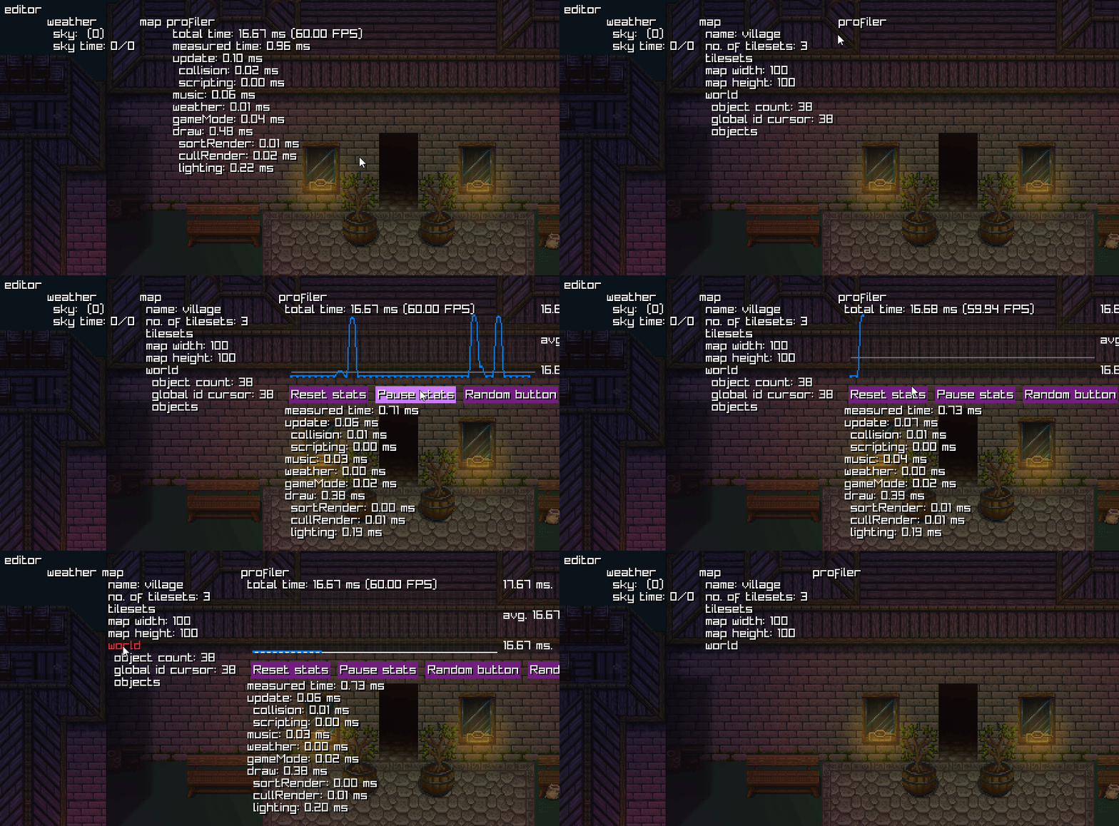
Today, I've finally reworked the editor UI we've had in the framework. The old editor supported collapsing menu items only. My goal was to implement horizontal placing (for buttons or side-by-side menu items), graph renderer and several UI components
HORIZONTAL SPACING
The biggest issue with the old build was that we couldn't display menu entries next to each other. The only thing we were able to achieve was to collapse items in a contextual menu. However, with the recent work, we can properly place menu entries next to each other without them colliding.

GRAPH RENDERER
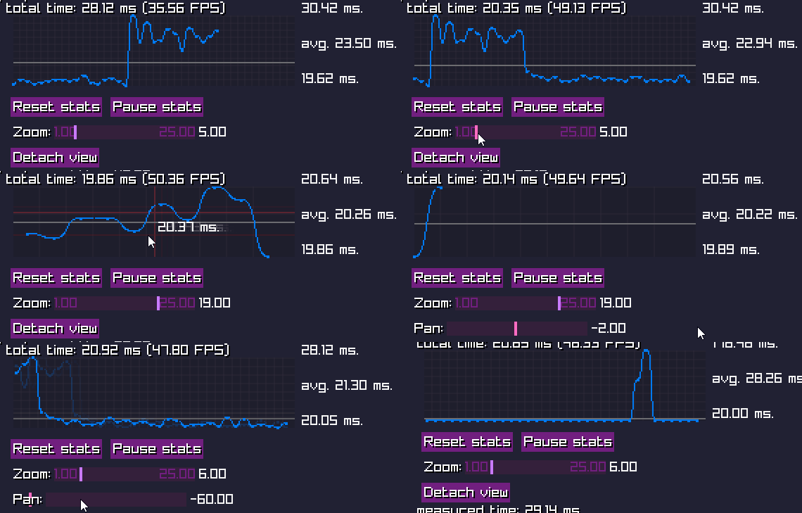
I found the current profiler lacklusting, so I've decided to implement customizable graph which effectively scales with wild data and also offers various features on top of that. It shows the maxima and minima of your values, as well as the average value (with a horizontal line). Hover over any part of the graph with cursor and it will show you an approximate value between submitted graph nodes with rulers.

BUTTONS AND SLIDERS
As seen above, buttons and sliders are also part of this new update. They can use horizontal spacing to save space vertically and can also by styled optionally.
That is all for today's devblog, I really love working on this stuff so far!
Files
Get Rurik Framework
Rurik Framework
A 2D cross-platform game engine/framework experiment.
| Status | Canceled |
| Category | Tool |
| Author | Dominik Madarász |
| Tags | 2D, Game engine, golang, keep-it-simple-stupid |
More posts
- Virtual Filesystem!Apr 29, 2019
- Entity system refactor + frontend changesJan 10, 2019
- Small changes and tweaksJan 01, 2019
- First releaseDec 31, 2018
Leave a comment
Log in with itch.io to leave a comment.